
A Google Reviews widget can do very different jobs depending on where you place it. On a homepage, it may need to build trust in a few seconds. On a service page, it should support a specific decision. On a dedicated reviews page, visitors may want to browse much more feedback before they act.
That is why choosing a layout is not just a design decision. It is a page-strategy decision.
The best Google Reviews widget layout is the one that matches the amount of attention a visitor is willing to give reviews on that page.
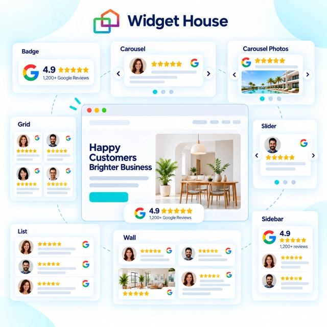
Widget House includes eight Google Reviews layout options: Badge, Carousel, Carousel Photos, Slider, Grid, List, Sidebar, and Wall. This guide explains what each format is best at, where it fits naturally, and how to combine layouts across a website without making every page look the same.
Google Reviews Widget Layouts at a Glance
Start with the role reviews need to play on the page, then choose the layout that delivers that proof with the right visual weight.
| Layout | Best for | Visual weight | Good placements |
|---|---|---|---|
| Badge | Fast trust signal | Very low | Hero, CTA, contact form, pricing |
| Carousel | Several reviews in limited space | Medium | Homepage, product, service, landing page |
| Carousel Photos | Visual customer proof | Medium to high | Hospitality, beauty, fitness, home services, events |
| Slider | Focused testimonial moments | Medium | Service sections, landing pages, long-form pages |
| Grid | Scanning multiple reviews | High | Reviews page, location page, detailed landing page |
| List | Reading reviews in depth | High | Reviews page, service page, case-study style content |
| Sidebar | Persistent supporting proof | Low to medium | Blog, guide, service page, desktop content layouts |
| Wall | High-volume social proof | Very high | Dedicated reviews page, campaign page, brand story |
Choose the Layout by Page Goal, Not by Favorite Design
Before comparing templates, decide how much attention reviews deserve at that point in the customer journey.
A visitor on a homepage is still orienting themselves. A visitor on a pricing page may need only one last trust signal. A visitor on a reviews page has already chosen to spend time evaluating customer experiences.
Those situations call for different levels of review density.
Reviews should reassure
Use a small format when the main content is the offer, form, price, or CTA. Badge and Sidebar are strongest when reviews support the decision without interrupting it.
Reviews should persuade
Use Carousel, Carousel Photos, or Slider when you want customer proof to become a visible content section while keeping the page compact.
Reviews should be explored
Use Grid, List, or Wall when visitors are expected to scan many reviews, compare experiences, and spend more time with social proof.
Reviews should show, not only tell
Use Carousel Photos or Wall when customer images are a meaningful part of the decision and can communicate the experience faster than text alone.
Badge: Best for Fast Trust Near High-Intent Actions
A Badge is the smallest and least disruptive way to bring Google review proof into a page.

It works when visitors do not need to read a full set of reviews at that moment. Instead, they need a quick reason to feel comfortable taking the next step.
That makes Badge especially useful close to high-intent elements such as:
- Book now or Get a quote buttons;
- contact and lead forms;
- pricing sections;
- checkout or purchase areas;
- the homepage hero when space is tight.
A Badge is also a good companion layout. You can use it near an important CTA and still place a richer Carousel, Grid, or Wall lower on the same page.
Carousel: Best All-Round Layout for Homepages and Landing Pages
Carousel is the safest default when you want a recognizable review section without giving it too much vertical space.
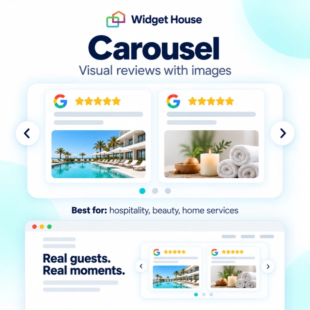
As a layout pattern, a carousel lets visitors see several review cards in a compact horizontal section and continue browsing if they want more. That balance makes it suitable for pages where reviews are important but not the entire point of the page.
Carousel works especially well on:
- homepages;
- product and service pages;
- campaign landing pages;
- pricing pages with room for a full trust section;
- pages where multiple customer voices should be visible without creating a long wall of content.
It is also easy to place between two major content blocks. For example, a service page can explain the offer, show a Carousel, and then move into pricing or a contact CTA.
Carousel Photos: Best When the Customer Experience Is Visual
Some businesses benefit when review text is supported by customer photos because the result, atmosphere, product, or experience is easier to understand visually.
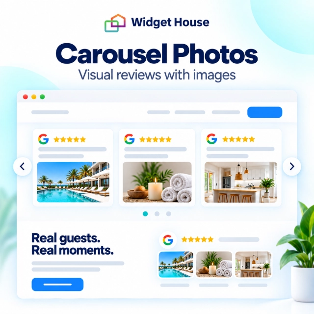
Carousel Photos gives those images more prominence while keeping the section compact enough for a homepage or landing page.
This layout can be particularly useful for categories such as:
- restaurants, cafes, and hospitality;
- salons, beauty, and wellness;
- fitness studios and gyms;
- home improvement and repair services;
- events and entertainment;
- retail or product-led local businesses where customer photos add context.
Use it only when the images contribute useful proof. If most reviews are text-only, a standard Carousel will usually feel cleaner and more consistent.
Slider: Best for Focused Testimonial Moments
Slider works best when you want reviews to feel more like featured testimonials than a feed.
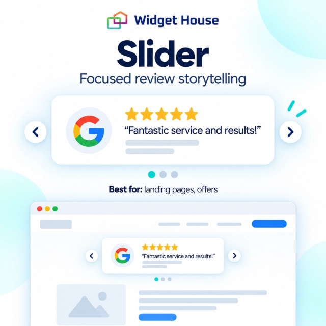
For layout planning, think of Slider as a more focused review moment: fewer reviews compete for attention at once, so each customer story can carry more visual weight.
That makes it useful in long-form pages where you want to place social proof between major sections. A strong pattern is:
- Explain a problem or service.
- Show a focused review.
- Continue with the next product benefit, use case, or CTA.
Slider is a good choice for service businesses, consultants, SaaS landing pages, and other sites where a single detailed customer voice can reinforce a specific message.
Grid: Best for Easy Scanning and Deeper Evaluation
Grid gives visitors several reviews at once and makes the section feel substantial without forcing them into a single reading order.
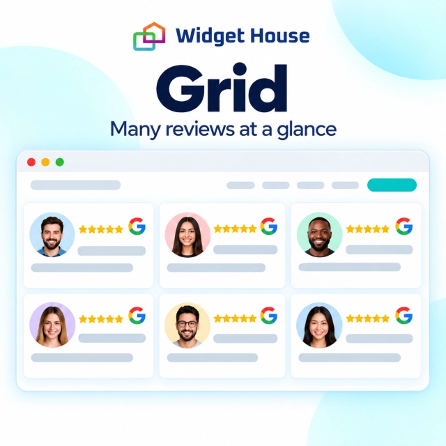
That is useful when social proof is one of the main reasons someone is on the page. Visitors can scan names, star ratings, short excerpts, and recurring themes before deciding what to read in full.
Grid is a strong fit for:
- dedicated review or testimonial pages;
- location pages for local businesses;
- service pages where trust is a major barrier;
- high-consideration landing pages;
- sections near the bottom of a homepage where visitors are already evaluating the brand more seriously.
The main trade-off is space. A Grid deserves room. If the page already has many cards, pricing tables, feature blocks, and visual modules, another grid can make the design feel heavy.
List: Best for Reading Review Text in Depth
List is the strongest choice when review content matters more than visual variety.
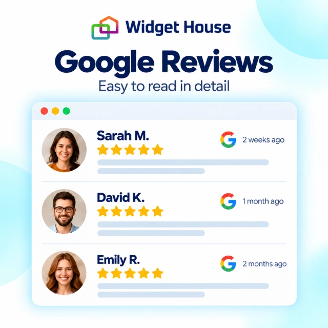
Instead of asking visitors to scan several cards across columns, a List creates a clear vertical reading flow. That can make longer reviews easier to follow and gives each review more room.
Use List when:
- reviews tend to contain useful detail;
- customers describe a process, service quality, or outcome;
- you want the section to feel calm and editorial rather than highly visual;
- the page already uses many multi-column components and needs a simpler content rhythm.
List can be particularly effective on service pages where customers talk about responsiveness, communication, installation, support, or other details that are difficult to communicate in a short excerpt.
Sidebar: Best for Supporting Proof Beside Main Content
Sidebar is useful when reviews should stay close to the main content without becoming a full-width section.
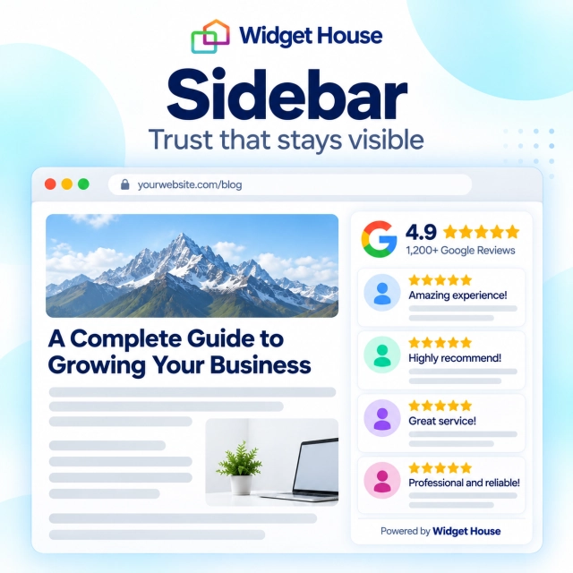
This pattern works especially well on wider desktop layouts where the page naturally has a secondary column. The review widget can support what the visitor is reading while the main column remains focused on the service, article, guide, or offer.
Good placements include:
- service or location pages with a two-column design;
- long guides or educational pages;
- blog content with a conversion-focused side area;
- comparison pages where reviews act as supporting evidence rather than the main content.
The main design question is mobile behavior. A sidebar that feels perfectly balanced on desktop becomes a normal stacked block on smaller screens, so the review content should still make sense when it moves into the page flow.
Wall: Best for High-Impact Social Proof
Wall is the most immersive option when you want reviews to become a major visual part of the page.
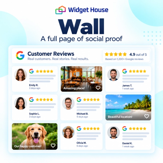
Compared with a compact Carousel or focused Slider, a Wall can communicate abundance. It works best when the business wants to show that customer feedback is not an isolated proof point but a large, visible part of the brand story.
Wall fits naturally on:
- dedicated review pages;
- brand or community pages;
- campaign pages built around social proof;
- event, hospitality, beauty, and lifestyle pages where review photos can create visual energy;
- bottom-of-page trust sections with enough space to breathe.
Because Wall has strong visual weight, it should not sit next to several other dense sections. Give it generous spacing and let it be the main proof block in that part of the page.
Best Google Reviews Layout for Each Website Page
The same business can use different layouts across the site because each page has a different job.
| Page type | Recommended layout | Why it fits |
|---|---|---|
| Homepage hero | Badge | Adds reputation proof without distracting from the main value proposition. |
| Homepage trust section | Carousel | Shows multiple customer voices while keeping the page compact. |
| Visual business homepage | Carousel Photos | Adds customer imagery when visual proof is part of the buying decision. |
| Service page | Slider or List | Lets reviews reinforce specific service claims or provide detailed customer context. |
| Product landing page | Carousel or Slider | Creates a clear persuasion block without turning the page into a review directory. |
| Pricing or booking page | Badge | Provides reassurance near the moment of commitment. |
| Location page | Grid or List | Gives visitors more room to evaluate local customer experiences. |
| Blog or guide | Sidebar or Slider | Supports the content without dominating the reading experience. |
| Dedicated reviews page | Grid, List, or Wall | Visitors have explicitly chosen to explore social proof in depth. |
You Do Not Need to Use the Same Review Layout Everywhere
Consistency matters, but consistency does not mean repeating one identical review block across every page.
A stronger approach is to keep the visual language consistent while changing the amount of proof based on intent.
1. Start compact
Use Badge in the hero, next to a form, or close to pricing where visitors need reassurance without extra friction.
2. Add a richer proof section
Use Carousel, Carousel Photos, or Slider lower on the page where visitors have more attention to give.
3. Offer depth when needed
Use Grid, List, or Wall on a dedicated reviews or location page for visitors who want to investigate further.
4. Match the surrounding content
Choose Sidebar when reviews are secondary to a long article, guide, comparison, or service explanation.
Preview the Layout Before You Publish
The easiest way to choose between layouts is to see how each one fits the real page instead of judging it in isolation.
Open the Widget House Google Reviews builder, switch between Badge, Carousel, Carousel Photos, Slider, Grid, List, Sidebar, and Wall, and compare how much space each layout takes around your actual content.
Pay attention to three things: whether the review section competes with the main CTA, whether the amount of visible review content matches the visitor's intent, and whether the layout still feels natural on mobile.
Try different Google Reviews layouts in the Widget House builder and choose the format that fits your page before publishing it.
Final Verdict: Match Review Density to Visitor Intent
There is no single Google Reviews layout that works best on every page.
The best approach is to match review density and visual weight to the page’s purpose. Use compact layouts where the next action should stay dominant, and denser formats where exploring customer experiences is part of the decision process.
Frequently Asked Questions
What is the best Google Reviews widget layout for a homepage?
Carousel is the strongest general-purpose choice for a homepage because it can show several customer voices in a compact section. A Badge also works well near the hero or primary CTA, while Carousel Photos is useful when customer images are part of the experience you want to sell.
Which layout is best for a dedicated reviews page?
Grid, List, and Wall are the strongest options because visitors on a dedicated reviews page are already willing to spend more time exploring customer feedback. Choose Grid for scanning, List for reading detail, and Wall for a more immersive social proof presentation.
Should I use the same Google Reviews layout on every page?
No. Different pages have different goals. A Badge can work near pricing or a form, Carousel can support a homepage, Slider can fit a service page, and Grid or Wall can provide deeper proof on a dedicated reviews page.
When should I use a photo review layout?
Use Carousel Photos or a visually rich Wall when customer images help explain the result, atmosphere, product, or experience. If images do not add meaningful proof, a text-focused Carousel, Slider, Grid, or List will usually be cleaner.
Can I combine a review Badge with a larger review section?
Yes. That is often a useful page pattern: use a compact Badge near a high-intent CTA and a larger Carousel, Grid, List, or Wall later on the page for visitors who want more evidence.